Additional links:
- Original class material
<< Previous lecture | Next lecture >>
todo clean
Dimensionality Reduction
While working with data, it is common to have access to very high-dimensional unstructured informations (e.g. images, sounds, …). To work with them, it is necessary to find a way to project them into a low-dimensional space where data which is semantically similar is close. This approach is called dimensionality reduction.
For example, assume our data can be stored in an array,
where each datapoint . The idea of dimensionality reduction techniques in ML is to find a projector operator , with , such that in the projected space , images semantically similar are close together. If the points in a projected space forms isolated populations such that inside of each population the points are close, while the distance between populations is large, we call them clusters. A clustering algorithm is an algorithm which is able to find clusters from high-dimensional data.
Principal Component Analysis (PCA)
Principal Componenti Analysis (PCA) is probably the simplest yet effective technique to perform dimensionality reduction and clustering. It is an unsupervised algorithm, thus it does not require any label.
The idea is the following: consider a dataset of high-dimensional data and assume we want to project it into a low-dimensional space . Define
the projected version of . We want to find a matrix such that , with the constraint that in the projected space we want to keep as much information as possible from the original data .
You already studied that, when you want to project a matrix by keeping informations, a good idea is to use the Singular Value Decomposition (SVD) of it and, in particular, the Truncated SVD (TSVD). Let , then
is the SVD of , where , are orthogonal matrices ( and ), while is a diagonal matrix whose diagonal elements are the singular values of , in decreasing order (). Since the singular values represents the quantity of informations contained in the corresponding singular vectors, keeping the first singular values and vectors can be the solution to our projection problem. Indeed, given , we define the Truncated SVD of as
where , , and .
The PCA use this idea and defines the projection matrix as , and consequently,
is the projected space. Here, the columns of are called feature vectors, while the columns of are the principal components of .
Implementation of PCA (Pseudocode)
To implement PCA, we first need to center the data. This can be done by defining its centroid.
DEFINITION
Centroid: Given a set its centroid is defined to be
Thus, the implementation of PCA is as follows:
- Consider the dataset ;
- Compute the centered version of as , where the subtraction between matrix and vector is executed column-by-column;
- Compute the SVD of , ;
- Given , compute the Truncated SVD of : ;
- Compute the projected dataset ;
Python example
For the following example, I’m assuming you downloaded the MNIST dataset, either from Virtuale or from Kaggle (click here do download it), renamed it data.csv and placed it in the same folder of the Python file on which you are working.
The first step is to load the dataset into memory, this can be done with Pandas as we saw into the first lecture.
import numpy as np
import pandas as pd

# Load data into memory
data = pd.read_csv('data.csv')
After that, it is important to inspect the data, i.e. to look at its structure and understand how it is distributed. This can be done either by reading at the documentation of the website where the data has been downloaded or by using the pandas method .head().
# Inspect the data
print(f"Shape of the data: {data.shape}")
print("")
print(data.head())
which prints out all the columns of data and the first 5 rows of each column. With this command, we realize that our dataset is a frame, where the columns from the second to the last are the pixels of an image representing an handwritten digit, while the first column is the target, i.e. the integer describing the represented digit.
Following the Introduction to ML, first of all we convert the dataframe into a matrix with numpy, and then we split the input matrix and the corresponding target vector . Finally, we note that is an matrix, where and . Since in our notations the shape of must be , we have to transpose it.
# Convert data into a matrix
data = np.array(data)

# Split data into a matrix X and a vector Y where:
#
# X is dimension (42000, 784)
# Y is dimension (42000, )
# Y is the first column of data, while X is the rest
X = data[:, 1:]
X = X.T

Y = data[:, 0]

print(X.shape, Y.shape)

d, N = X.shape
Visualizing the digits
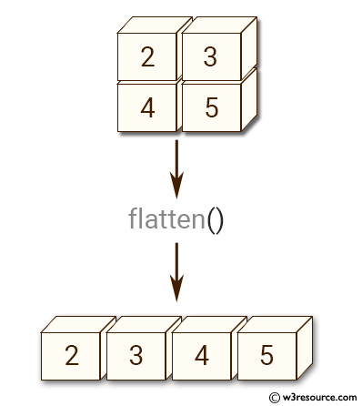
We already said that is a dataset of images representing handwritten digits. We can clearly visualize some of them. In the documentation, we can read that each datapoint is a grey-scale image, which has been flattened. Flattening is the operation of taking a 2-dimensional array (a matrix) and converting it to a 1-dimensional array, by concatenating the rows of it. This can be implemented in numpy with the function a.flatten(), where a is a 2-dimensional numpy array.
Since we know that the dimension of each image was before flattening, we can invert this procedure by reshaping them. After that, we can simply visualize it with the function plt.imshow() from matplotlib, by setting the cmap to 'gray' since the images are grey-scale.
import matplotlib.pyplot as plt

def visualize(X, idx):
    # Visualize the image of index 'idx' from the dataset 'X'

    # Load an image in memory
    img = X[:, idx]

    # Reshape it
    img = np.reshape(img, (28, 28))

    # Visualize
    plt.imshow(img, cmap='gray')
    plt.show()

# Visualize image number 10 and the corresponding digit.
idx = 10
visualize(X, idx)
print(f"The associated digit is: {Y[idx]}")
Splitting the dataset
Before implementing the algorithm performing PCA, you are required to split the dataset into a training set and a test set, following the Introduction to ML. Remember that to correctly split , it has to be random.
def split_data(X, Y, Ntrain):
    d, N = X.shape

    idx = np.arange(N)
    np.random.shuffle(idx)

    train_idx = idx[:Ntrain]
    test_idx = idx[Ntrain:]

    Xtrain = X[:, train_idx]
    Ytrain = Y[train_idx]

    Xtest = X[:, test_idx]
    Ytest = Y[test_idx]

    return (Xtrain, Ytrain), (Xtest, Ytest)

# Test it
(Xtrain, Ytrain), (Xtest, Ytest) = split_data(X, Y, 30_000)

print(Xtrain.shape, Xtest.shape)
Now the dataset is divided into the train and test components, and you can implement the PCA algorithm on . Remember to not access during training.
A note on SVD
In Python, the (reduced) SVD decomposition of a matrix can be implemented as
# SVD of a matrix A
U, s, VT = np.linalg.svd(A, full_matrices=False)
where , , with , is a vector containing the non-zero singular values of , , in decreasing order.
Visualizing clusters in Python
When , it is possible to visualize clusters in Python. In particular, we want to plot the datapoints, with the color of the corresponding class, to check how well the clustering algorithm performed in 2-dimensions. This can be done by the matplotlib function plt.scatter. In particular, if is the projected dataset and is the vector of the corresponding classes, then
# Visualize the clusters
plt.scatter(z[0, :], z[1, :], c=Y)
plt.show()
will do the job.
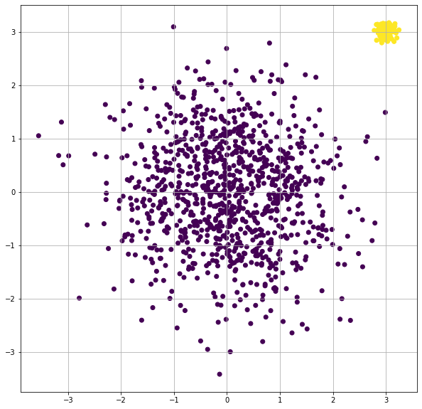
Working example
Here I report a working example on how to visualize clusters on matplotlib with the function plt.scatter(). In the example, we generate two clusters, composed by normally distributed datapoints in 2-dimensions, from two different gaussian distributions. The first class is labelled as 0, while the second one is labelled as 1. The datapoints are colored into the scatterplot with a different color for each class.
import numpy as np
import matplotlib.pyplot as plt

# Create two cloud of points in 2-dimensional space
# and plot it, divided by color
x1 = np.random.normal(0, 1, (2, 1000))
x2 = np.random.normal(3, 0.1, (2, 100))

y1 = np.zeros((1000, ))
y2 = np.ones((100, ))

# Visualize them (coloring by class)

# Join together x1 x2, y1 y2
X = np.concatenate((x1, x2), axis=1)
Y = np.concatenate((y1, y2))

# Visualize
plt.scatter(X[0, :], X[1, :], c=Y)
plt.show()
This is the result:
Homework
Now let’s head over to Homework 2.