Visualization in Python can be performed by a famous library named matplotlib, in particular its sub-package matplotlib.pyplot. Documentation can be found at matplotlib.org.
Plotting in matplotlib is very easy. Given two N-dimensional vectors x=(x1,…,xN) and y=(y1,…,yN), containing the N datapoints we want to represent, the function plot(x, y) will plot on the plate each couple (xi,yi) for i=1,…,N, and will connect (by default) them with a line. Such a plot can be visualized by calling the function show().
For instance:
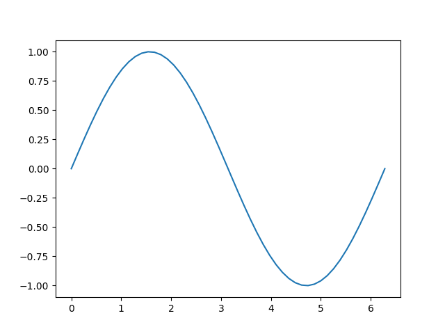
import numpy as npimport matplotlib.pyplot as plt# Creating two vectorsa = 0b = 2*np.piN = 50x = np.linspace(a, b, N)y = np.sin(x)# Visualizeplt.plot(x, y)plt.show()
Output:
As you can see, the code above will plot the sine function. We now want to see how we can change the aesthetics of this plot, by adding title, axis grid, axis label, …
Customizing the plot
In matplotlib, most of the customization we want to add to the plot must be inserted in between the line plt.plot(x, y) and the line plt.show(). The most common customization functions are:
plt.title(str): Add a title to the plot;
plt.xlabel(str): Add a label to the x-axis;
plt.ylabel(str): Add a label to the y-axis;
plt.grid(): Add an axis grid on the background of the plot;
plt.xlim([a, b]): Force the horizontal limit of the axis to be a and b;
plt.ylim([a, b]): Force the vertical limit of the axis to be a and b;
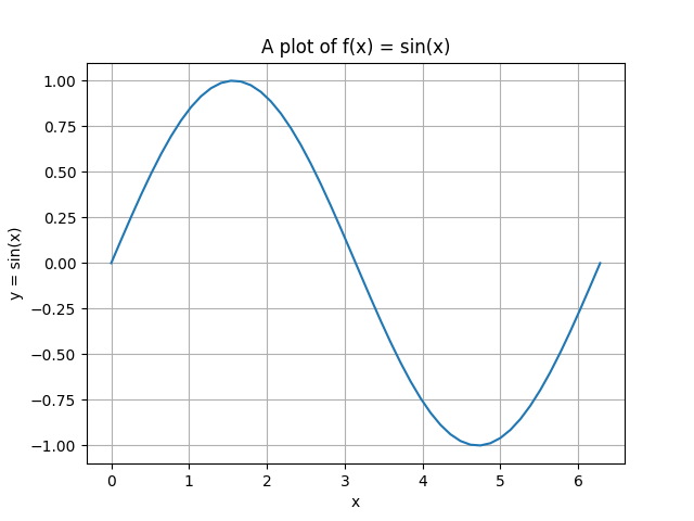
For example, we can customize the plot above to obtain something like that
import numpy as npimport matplotlib.pyplot as plt# Creating two vectorsa = 0b = 2*np.piN = 50x = np.linspace(a, b, N)y = np.sin(x)# Visualizeplt.plot(x, y)plt.title('A plot of f(x) = sin(x)')plt.xlabel('x')plt.ylabel('y = sin(x)')plt.grid()plt.show()
Output:
Multiplot and Line customization
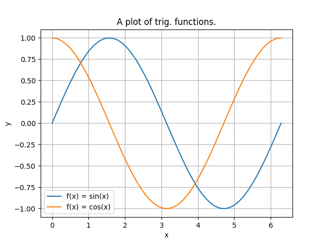
Clearly, it is also possible to plot more than one line at the same time. Simply define other x′,y′∈RN containing the new data we want to plot and add another plt.plot(x', y') in between plt.plot(x, y) and plt.show().
import numpy as npimport matplotlib.pyplot as plt# Creating two vectorsa = 0b = 2*np.piN = 50x = np.linspace(a, b, N)y1 = np.sin(x)y2 = np.cos(x)# Visualizeplt.plot(x, y1)plt.plot(x, y2)plt.title('A plot of trig. functions.')plt.xlabel('x')plt.ylabel('y')plt.legend(['f(x) = sin(x)', 'f(x) = cos(x)'])plt.grid()plt.show()
Output:
As you can see, in the bottom-left of the plot, we also printed out a legend. Following the code above, it is easy to understand that a legend can be simply introduced by listing the name of the lines, ordered with respect to the ordering of the plt.plot() functions. Matplotlib will visualize the correct color of the line accordingly.
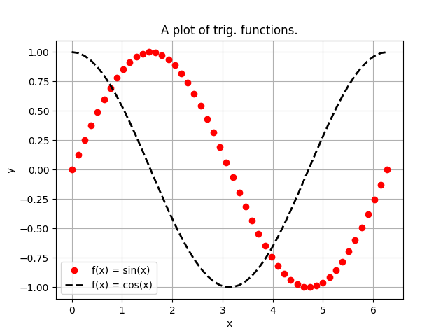
Clearly, we can also modify the line specifications such as the color, the thickness and the style. To to that, we have to insert the following specifications inside of the corresponding plt.plot() line.
color='str': Change the color of the line. A list of all the available colors can be found here;
linewidth=int: Change the thickness of the line.
Moreover, the style of the line can be modified by adding some specifications just after the y input. For example,
"o": Changes the linestyle to rounded markers;
"--": Changes the linestyle to be dotted lines;
"o-": Changes the linestyle to be a continuous line with markers on the points defined by (x, y).
A complete list of all the possible linestyles can be found here.
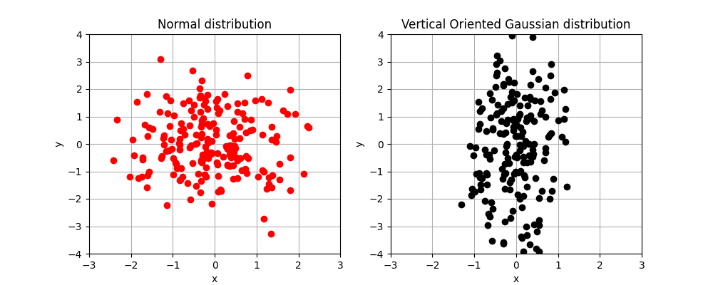
Subplots are required to create a matrix of plots inside of the same figure, which can be very useful for various visualizations.
A subplot is created by first defining a figure. This can be done by the line plt.figure(figsize=(w, h)) where the figsize argument is required to change the proportion of the resulting plot. After that, it is possible to open a subplot with the command plt.subplot(nrow, ncol, idx), where nrow and ncol represents the number of images per rows and the number of images per columns in our matrix of plots, while idx is an incremental value, starting from 1, that indicate where the plot we are going to do should be placed inside of the matrix. idx=1 represents the upper-left corner and, while increasing, it moves the image from left to right and from up to down into the matrix.
Each time we want to open a different plot in our subplot, we have to specify the command plt.subplot(nrow, ncol, idx) again, with the same nrow and ncol argument, but different idx.
Going back to the example in the introductory post on Numpy where we introduced the library pandas, useful to read data into Python, we can now use matplotlib to visualize it.
If you haven’t already, download the dataset here and place the resulting .csv file into the same folder of your .py file. Then:
Import the data into Python;
Explore the data by visualizing the first rows and the columns of it (the function data.head() from pandas can be useful), or alternatively, use the data documentation on Kaggle;
Create a new column, total_date, representing each date into an increasing number, the days since the beginning of the data collection;
Plot the number of birth with respect to total_date to visualize the incremental number of birth during the years;
Optional: Plot a barplot of the number of birth with respect to the day of the week and investigate if there are asymetries in the birth number in some days of the week.
Example solution
 import pandas as pd
 import numpy as np
 # Read data from a csv file
 data = pd.read_csv('./US_births_2000-2014_SSA.csv')
 # Cast into numpy array
 np_data = np.array(data)
 # Check that the dimension didn't change
 print(f"{data.shape} should be equal to {np_data.shape}")
import matplotlib.pyplot as pltsaturday_births_data = np_data_total[0::7,5] sunday_births_data = np_data_total[1::7,5] monday_births_data = np_data_total[2::7,5] tuesday_births_data = np_data_total[3::7,5] wednesday_births_data = np_data_total[4::7,5] thursday_births_data = np_data_total[5::7,5] friday_births_data = np_data_total[6::7,5]# sum of the births happened per day of the week per year monday_births = np.sum(monday_births_data) tuesday_births = np.sum(tuesday_births_data) wednesday_births = np.sum(wednesday_births_data) thursday_births = np.sum(thursday_births_data) friday_births = np.sum(friday_births_data) saturday_births = np.sum(saturday_births_data) sunday_births = np.sum(sunday_births_data)print('monday\'s births: ', monday_births) print('tuesday\'s births: ', tuesday_births) print('wednesday\'s births: ', wednesday_births) print('thursday\'s births: ', thursday_births) print('friday\'s births: ', friday_births) print('saturday\'s births: ', saturday_births) print('sunday\'s births: ', sunday_births) print('total n. of births 2000-2014', np.sum(np_data_total[:,5])) print('should be equal to', monday_births+tuesday_births+wednesday_births+thursday_births+friday_births+saturday_births+sunday_births) births_per_weekday = { 'Monday': monday_births, 'Tuesday': tuesday_births, 'Wednesday': wednesday_births, 'Thursday': thursday_births, 'Friday': friday_births, 'Saturday': saturday_births, 'Sunday': sunday_births }days = list(births_per_weekday.keys()) births = list(births_per_weekday.values()) fig = plt.figure(figsize = (10, 5)) # creating the bar plot plt.bar(days, births, color ='red', width = 0.4) plt.xlabel("Day of the week") plt.ylabel("N. of births") plt.title("US births per weekday in the years 2000-2014")plt.show()